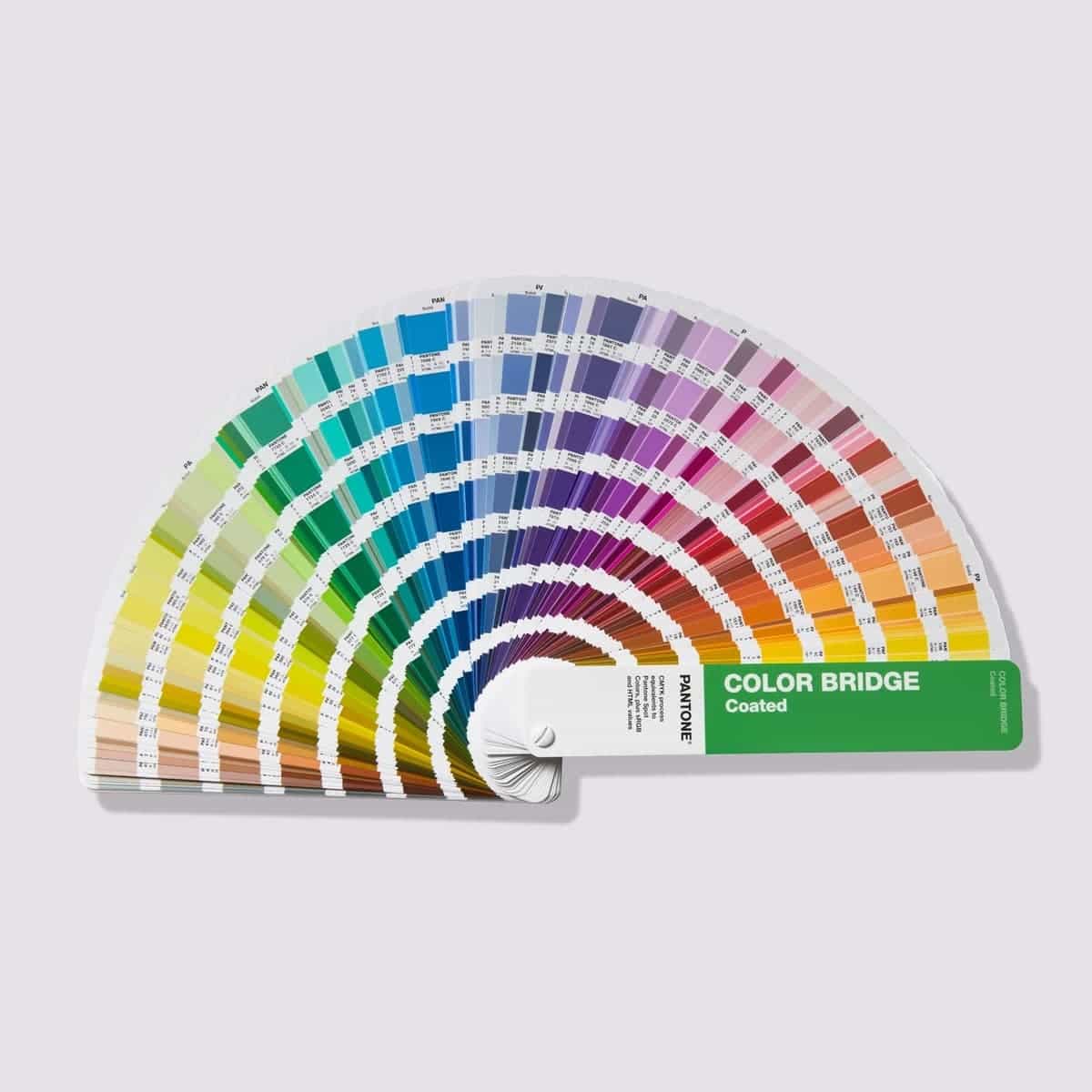
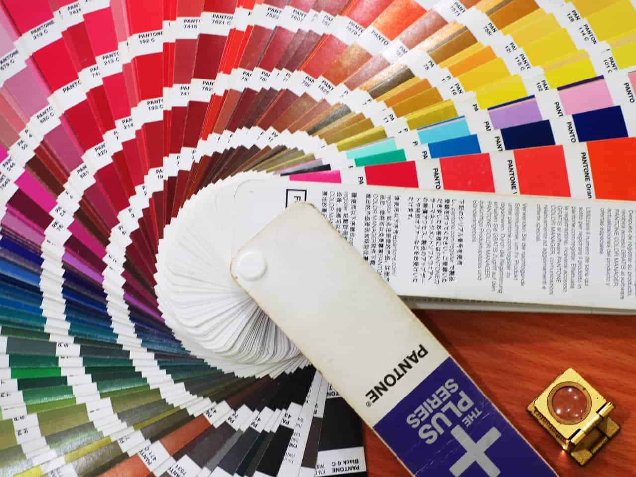
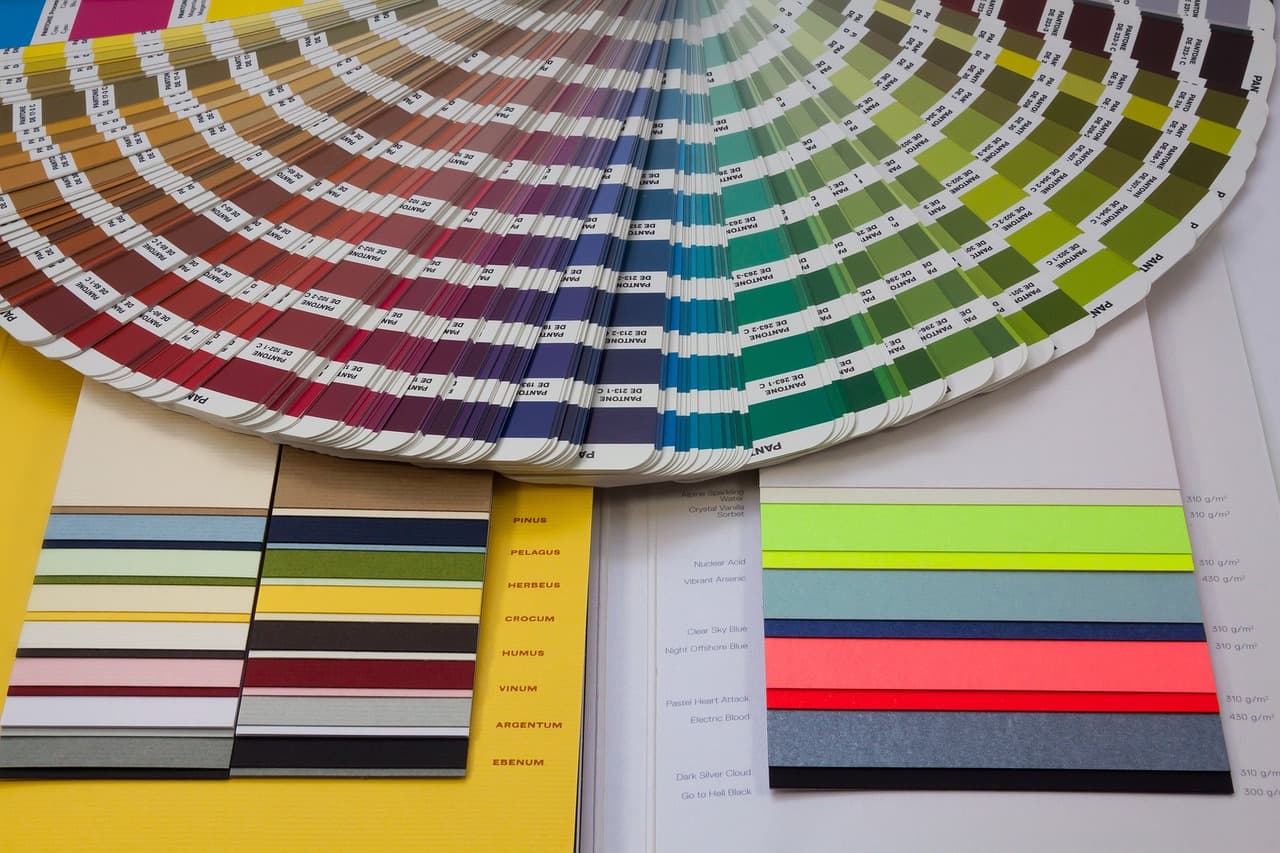
The Pantone Color Matching System (PMS) is a globally recognized standardized color system designed to ensure color accuracy across design, production, and printing. Established in 1963, it now offers over 2,000 standardized colors, each identified by unique codes and precise formulas. This system enables designers, manufacturers, and brands worldwide to achieve consistent color communication.
Pantone’s History and Popularity
Pantone began as a printing company addressing color communication challenges in design and production. In traditional printing, subjective color definitions often caused inconsistencies across equipment and processes. Pantone solved this with precise color formulas and coding, becoming the gold standard in industries like design, printing, and manufacturing.
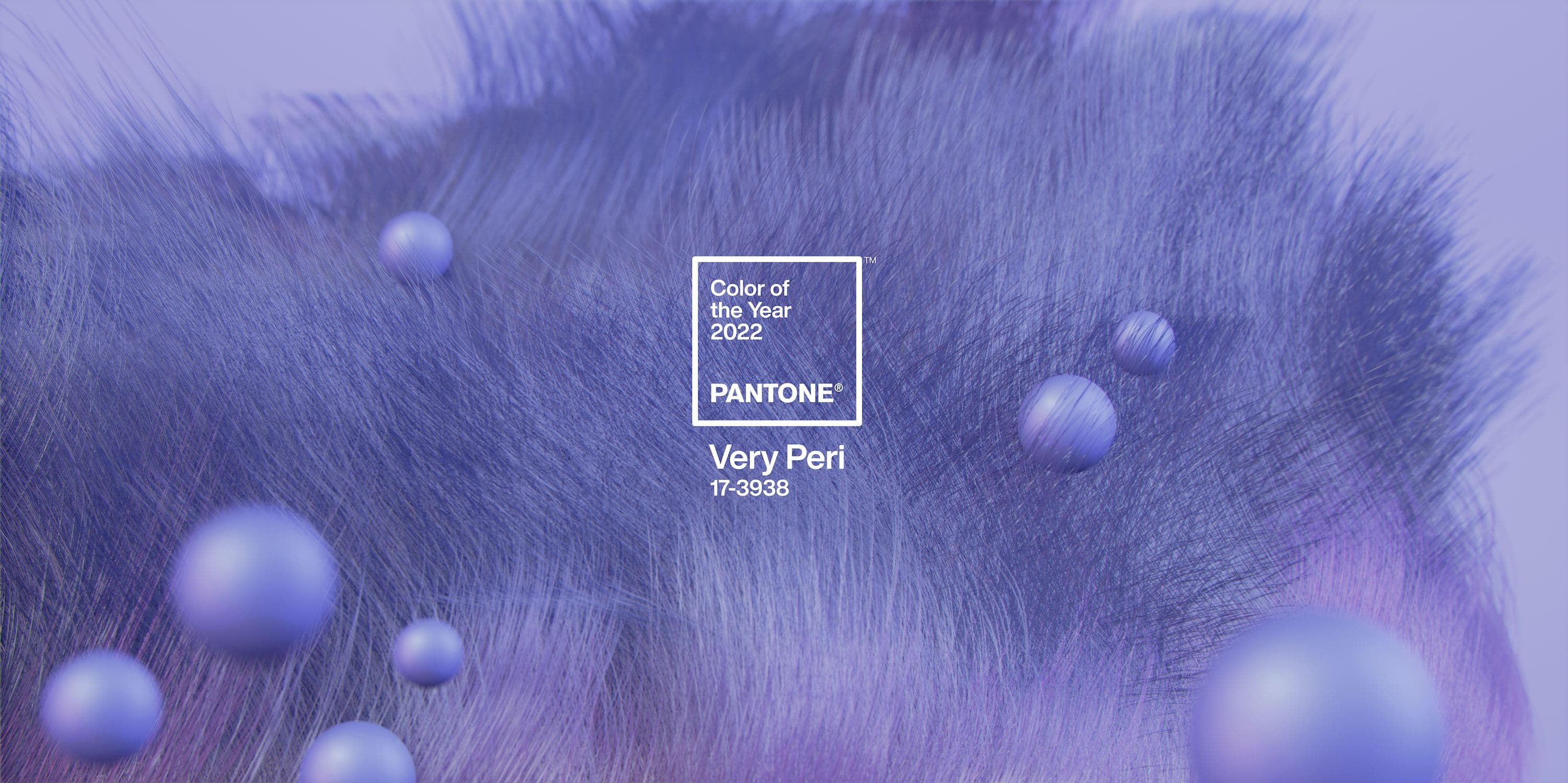
Pantone also gained fame for its Color of the Year releases, which reflect cultural trends and inspire industries such as fashion, home design, and consumer products. For example, 2022’s Very Peri (17-3938) symbolizes innovation and transformation.
Why ASNY Craft Factory Relies on Pantone for Metal Product Customization and Production
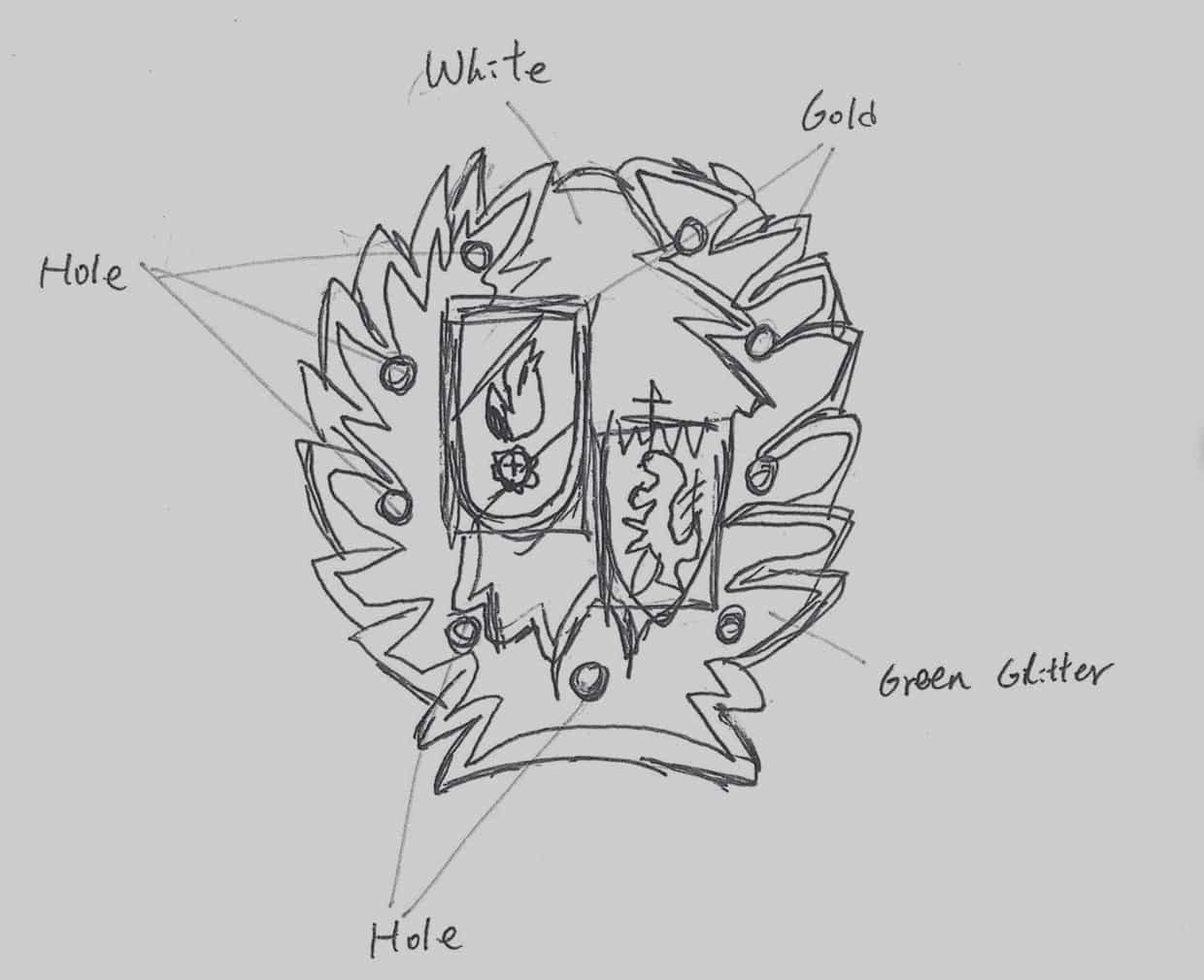
At ASNY Craft Factory, Pantone’s color standards are indispensable for producing custom badges, medals, coins, and souvenirs due to the following reasons:
- Standardized Color Reproduction
Color perception varies between individuals. When clients provide reference images or physical samples, Pantone offers an objective standard for precise color matching in industrial production.
Even if clients don’t specify a Pantone code, ASNY can use professional tools to convert colors from images or samples into Pantone codes. While not 100% accurate, this approach is the most reliable way to meet client expectations.
- Minimizing Color Discrepancies
Differences in screen displays often cause variations between design files and final products. For instance, a red hue on one device might appear different on another or on the final product.
By using Pantone codes instead of relying on screen displays, ASNY ensures accurate color reproduction during production. This standardized process eliminates guesswork and prevents mismatched expectations.
- Global Industry Standard
Compared to other color systems like CMYK or RAL, Pantone offers unmatched flexibility and precision, especially for small-batch customizations and diverse manufacturing techniques. Its global recognition makes it a universal language for design, production, and marketing.
Comparison with Other Color Standards in Industrial Production
- CMYK (Cyan, Magenta, Yellow, Black): Ideal for printing but limited for metal products, as ink cannot be directly applied to metal surfaces.
- RAL: Common in coatings and construction but lacks the variety and precision needed for detailed customization.
- Natural Color System (NCS): Often used in architecture but lacks specific formulas for industrial application.
- Munsell Color System (MCS): Used in education and labs but limited in color range and industrial applicability.
Pantone stands out for its extensive color options and adaptability to various techniques, making it the top choice for custom badges, coins, medals, and souvenirs.
How to Use Pantone to Minimize Color Variations
- Avoid Screen-Based Color References
Clients should refer to physical Pantone swatches rather than screen displays, as even official Pantone digital tools may introduce discrepancies.
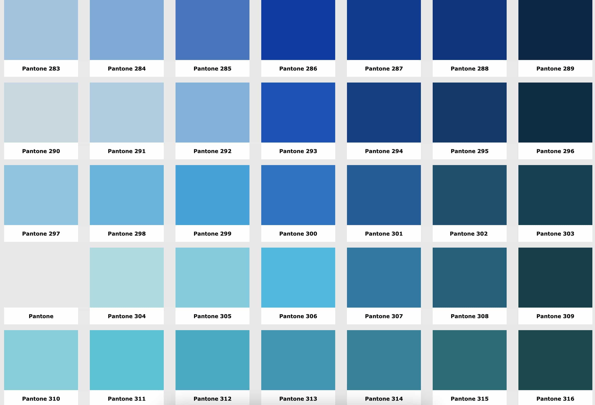
- Invest in Physical Pantone Swatches.
- Storage Tips: Keep swatches sealed and away from moisture and sunlight.
- Replacement Cycle: Update swatches every 12–18 months for accuracy.
- Confirm Colors Before Production
Ensure Pantone codes are finalized and signed off by clients before manufacturing begins to prevent misunderstandings.
Beyond Standardization: Pantone’s Role in Creativity and Market Trends
- Inspiration for Designers
Pantone isn’t just a tool for standardization—it’s also a source of creative inspiration. Vibrant or metallic shades from Pantone help designers create standout badges and souvenirs.
- Market Value of the Color of the Year
Pantone’s annual color choices influence consumer trends. For example, 2011’s Honeysuckle represented uplifting energy and positivity; 2021’s Ultimate Gray and Illuminating Yellow symbolized resilience and hope. ASNY leverages these trends to develop market-driven products, such as stylish cultural souvenirs.
Additional Strategies for Color Accuracy in Metal Products
In some cases, achieving specific color effects requires advanced printing techniques, such as:
- Offset Printing: Ideal for large-scale production with high-quality gradients and patterns, though surface requirements are strict.
- Silk-Screen Printing: Suitable for layered printing on metal or irregular surfaces, offering durability and texture.
- UV Printing: Uses UV-cured inks for fine details, gradients, and high-resolution imagery on metal.
These methods are perfect for scenarios like:
- Gradient Effects: When traditional enamel techniques cannot replicate complex gradients, printing ensures smooth transitions.
- Logo or Photo Reproduction: For replicating intricate logos or photos, printing achieves unmatched precision and detail.

Conclusion
The Pantone Color Matching System is integral to ASNY Craft Factory’s customization and production of badges, medals, coins, and souvenirs. Its extensive color range, precision, and adaptability make it a vital tool for minimizing color discrepancies and inspiring innovative designs. With proper usage and maintenance, Pantone bridges the gap between creativity and manufacturing, ensuring every custom piece reflects the client’s vision and brand identity.


